

Introduction
In traditional watchmaking, “grand complications” are the summit: not one clever function, but a disciplined stack of mechanisms—calendar logic, timekeeping virtuosity, and often sound—arranged so a human can read them at a glance. The point has never been complexity for its own sake. It’s compression: maximum information, expressed with taste.
That is exactly why the idea suddenly matters in wearables.
Luxury users aren’t asking a smartwatch to cosplay as a Patek. They’re asking it to behave like a serious object: legible without performing, elegant in motion, discreet in a meeting, and supported for long enough that it doesn’t feel disposable. The best connected watches borrow haute horology’s codes—dial grammar, hierarchy, finishing cues, and service expectations—then translate them into software, haptics, and data.
This article is written for U.S. luxury readers who care about both worlds. We’ll define what grand complications mean, show how they can be translated into modern smartwatch UX, review case studies from 2024–2026, and end with design frameworks you can use to judge the next generation.
From haute horology to wearables
What makes a grand complication
A complication is any function beyond hours, minutes, and seconds. A grand complication is generally understood as the elite tier—multiple major complications, often spanning distinct categories like calendar, timekeeping, and striking/chiming.
There’s no single worldwide referee for the term. But two sources are useful for anchoring the idea:
Chrono24’s overview of “What is haute horlogerie?” frames the big families collectors recognize: acoustic complications (repeaters/striking), astronomical/calendar complications, and timekeeping complications.
Forbes explored the definitional debates in “Watch Experts Attempt To Define The Grand Complication” (2013), underscoring why the term is part technical, part cultural.
Still, for design purposes, you can treat a grand complication as three things happening at once:
Dense information (calendar, moon phase, chronograph registers) that remains readable.
A ritual of interaction (setting, activating chimes, using pushers) that feels intentional.
An ethics of execution (finishing, tolerances, long-term serviceability) that signals it’s meant to last.
Collector’s note: The most persuasive grand complication dials don’t feel “busy.” They feel inevitable. That’s not engineering. That’s hierarchy.
Grand Complications in smartwatches
A smartwatch cannot be a grand complication in the mechanical sense—and trying to fake it usually looks like a gimmick: a spinning tourbillon animation that drains battery while telling you nothing.
But a smartwatch can earn the same type of respect if it achieves the same outcomes:
Complexity hidden behind simplicity. The watch does the hard work so you don’t have to.
Layered information design. What you need now is dominant; the rest is discoverable.
Discreet expression. Alerts and animations are optional, not mandatory.
In other words: the “complication” shifts from gears to UX logic.
Translating codes to UX
Haute horology has a vocabulary that’s surprisingly transferable.
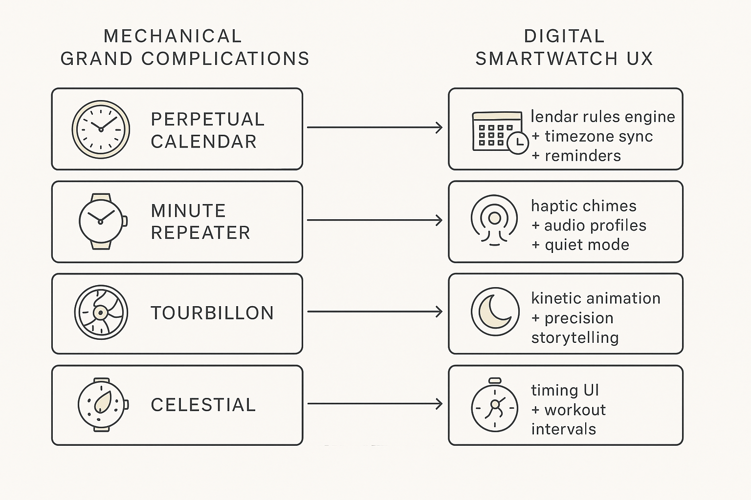
Dial grammar becomes information architecture: what’s primary, what’s secondary, what belongs to a sub-dial vs a swipe.
Correctors and pushers become intentional interactions: crown, button, long-press, or haptic “chime.”
Finishing becomes motion and typography: the way second hands sweep, the way complications animate, the way numerals sit on the wrist.
Service ethos becomes update cadence, battery strategy, and concierge-level support.
One practical lens: a digital complications watch face isn’t a “screen with widgets.” It’s a disciplined hierarchy that keeps time dominant while letting information emerge only when you ask.
If you want a single litmus test: a luxury smartwatch should make complicated things feel calm.
Digital Grand Complications
Perpetual calendars reimagined
A mechanical perpetual calendar is a miracle of rules encoded in metal. It “knows” month lengths and leap years, and (in typical descriptions) needs minimal correction across decades.
A. Lange & Söhne describes why the pairing of a repeater and perpetual calendar is such a technical feat in its MINUTE REPEATER PERPETUAL page, and the subtext matters for wearables: it’s not the display—it’s the logic.
For a perpetual calendar smartwatch, the UX bar is higher than “date + month”:
Time-zone correctness without drama (especially for frequent travel).
Smart reminders that feel like a discreet assistant, not a nag.
A “setting ritual” that’s safe—no accidental month jumps because you brushed the crown.
The best translation is invisible: you only notice it when it never breaks.
Repeaters via haptics and audio
A minute repeater is time told through sound—on demand, in a language your fingers learn.
In a smartwatch, the luxury move is not “louder speaker.” It’s control:
Haptic chime smartwatch patterns with distinct rhythms for hours/quarters/minutes.
Audio profiles that are tasteful and optional.
Etiquette modes (quiet rooms, board meetings, late-night travel) where the watch becomes almost private.
This is where digital can actually surpass mechanical: you can choose whether your “repeater” is sound, vibration, both, or neither.
Tourbillon, celestial, chronograph
These three are often misunderstood in wearables because they tempt designers into decorative motion.
Tourbillon (as code): not “spinning cage,” but precision theater—motion that communicates status, restraint, and craft. In digital form, that means animation that earns its battery cost and never steals legibility.
Celestial (as code): not “pretty stars,” but time beyond time—moon phase, night sky, travel rhythm. Digitally, astronomy APIs can make a celestial complication location-aware and actually correct.
Chronograph (as code): not just timing, but instrument logic: clear start/stop/reset affordances, readable registers, and confidence under stress.
Case studies 2024–2026
TAG Heuer Connected Calibre E5
TAG Heuer remains one of the clearest examples of a watchmaker insisting that a connected watch should still read like a watch.
Hodinkee’s introduction to the TAG Heuer Connected Calibre E5 highlights choices that matter for luxury UX:
Proportions and wearability (including a smaller case option), which is not a spec detail—it’s etiquette.
A design language that keeps the watch in the world of Swiss sport chronographs rather than consumer electronics.
On the brand side, TAG Heuer positions the E5 as a collection—materials, straps, and “watch faces inspired by icons”—not as a feature checklist. You can see how the brand frames the line in its Connected Calibre E5 collection page.
Design takeaway: E5 succeeds when it treats the screen as a dial first, and the apps as supporting actors.
LV, Hublot, Apple Watch Hermès
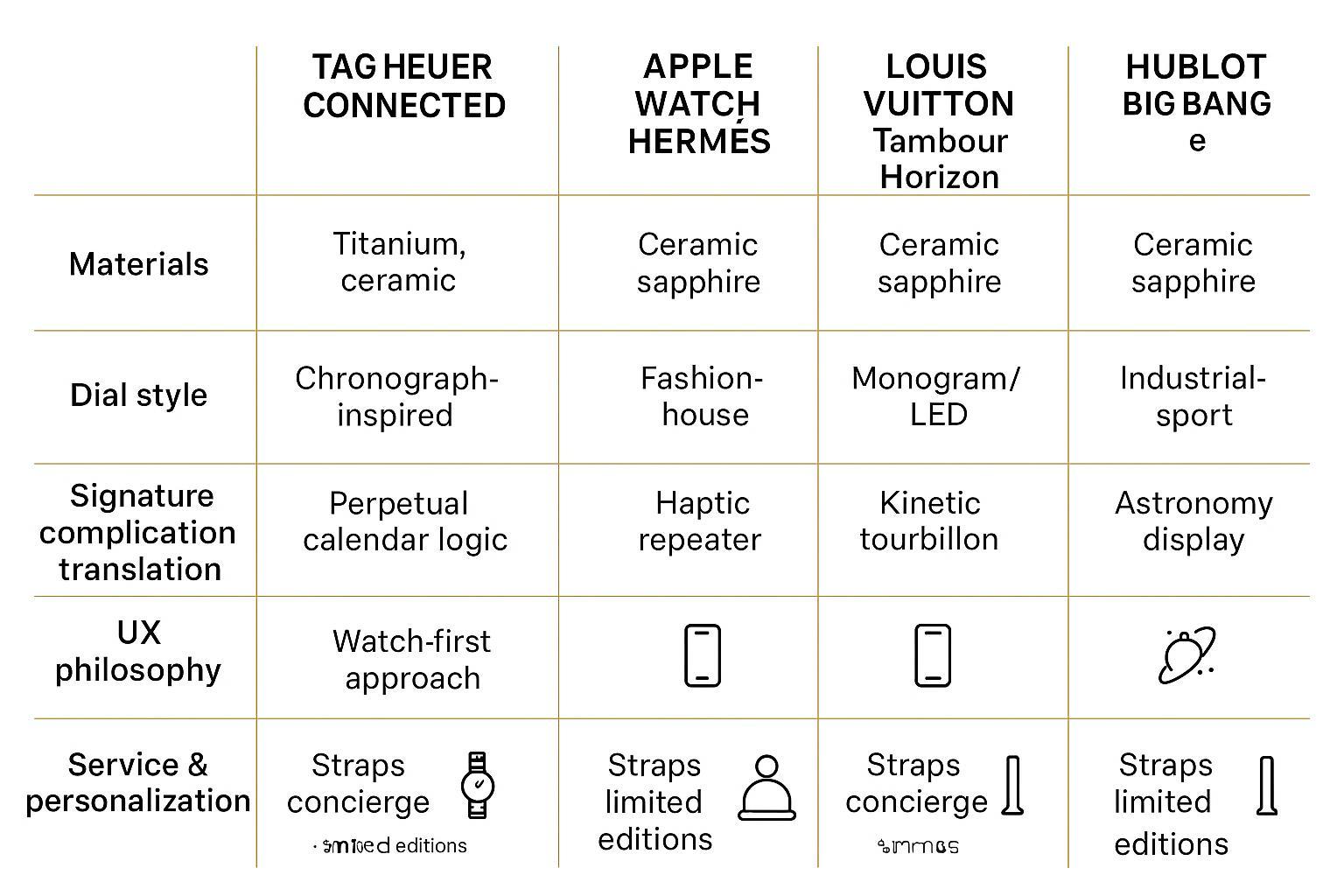
Luxury smartwatch “complications” tend to come in three flavors: watchmaker-led, fashion-house-led, and culture-led.
Louis Vuitton: brand codes as interface.
Louis Vuitton’s Tambour Horizon Light Up story page is essentially a manifesto: curved sapphire glass for an “endless screen,” and a bezel ring that becomes an animated monogram signature. The insight is not the LED—it’s the hierarchy: the Maison identity sits above the smart layer.
Hublot: architecture and materials as the dial.
Hublot’s newsroom announcement for the Big Bang e frames the connected watch as an extension of the “Art of Fusion”: premium case materials and a recognizable industrial architecture, with Wear OS underneath. This is a reminder that luxury is sometimes “owned” by the case and silhouette, not the UI.
Apple Watch Hermès: luxury is the strap, the face, and the experience.
Apple’s Apple Watch Hermès page makes the proposition clear: design + function, but the luxury delta is in the Hermès bands and exclusive dials.
Hermès itself reinforces that the aesthetic signature comes from materials and craft in its Apple Watch Hermès category.
Design takeaway: Hermès proves a blunt truth: in a smartwatch, luxury is often “surface area”—what touches the skin, what the room can see, and what the UI makes you feel.
Positioning, pricing, scarcity
In mechanical watchmaking, scarcity is part of the narrative: production limits, waiting lists, provenance.
In smartwatches, scarcity is more complicated. Chips and batteries age; software support has a half-life. So luxury positioning shifts away from “rare forever” and toward “rare and supported.”
Here’s the high-end positioning triangle to watch:
- Materialssapphire, ceramic, titanium—tactile legitimacy.
- Signature interfacea dial system with a clear visual identity.
- Service horizonrepairability, updates, battery strategy, and a credible support channel.
If you can’t get clarity on the service horizon, the watch is closer to fashion than horology.
Design frameworks
Dial grammar and hierarchy
In this section, treat each “complication” as a watch face grammar problem: what’s readable in one glance, what’s acceptable as a second layer, and what belongs in a deeper view.
For luxury smartwatch design, that becomes a hierarchy problem:
Primary layer (glance): time + one “complication” that matters today.
Secondary layer (intentional): the rich stuff—calendar detail, timing, celestial views.
Deep layer (setup): personalization, chime patterns, data permissions.
When brands get this wrong, you see it immediately: the dial becomes a dashboard, not a watch.
How to verify: Stand at arm’s length. If you can’t read the time in under a second, the hierarchy failed.
Outdoor legibility and AOD
Luxury buyers notice legibility because it’s a social signal. A watch that forces you to twist your wrist under restaurant lighting looks like a gadget.
Always-on display (AOD) is where grand complications smartwatch ambition goes to die. For an always-on display luxury watch, restraint is the whole point:
Reduce to essentials.
Use typography with real contrast.
Keep motion minimal (or none).
Materials also play a role. Vertu’s guide on advanced technology watches calls out sapphire crystal, titanium, and ceramic as build-quality hallmarks in its “Best Advanced Technology Watch: Quality & Performance Guide”. Even if you never buy from that category, the criteria are right: the display and case must age gracefully.
Software, data, longevity
In mechanical watchmaking, you service a movement.
In smartwatches, you service an ecosystem.
A luxury buyer framework:
Update policy: Is the interface stable? Are security updates credible?
Battery truth: Is the watch designed for daily charging, or multi-day use? Either can be acceptable—if it’s honest.
Data permissions: The more “complicated” the watch is digitally, the more it lives on your calendar, location, and health data.
This is where luxury should become conservative. A grand complication is trusted because it behaves predictably.
Ownership and services
Personalization and concierge
Grand complications are not only bought; they’re maintained. Collectors expect service that’s patient, discreet, and competent—someone who can solve problems without turning the object into a project.
Luxury wearables need the same ethos, even if the tasks are different:
concierge-level help with setup and travel scenarios
battery and repair workflows that don’t feel like you’re mailing in a gadget
secure onboarding, pairing, and recovery pathways
This is one place where VERTU is a relevant reference point—not as a “best pick,” but as an example of how luxury tech brands try to merge craftsmanship, materials, and a secure digital ecosystem with white-glove service.
VERTU’s brand profile is explicitly built around handcrafted construction, premium materials, and 24/7 concierge. On the product side, its own editorial framing of the VERTU Grand Watch leans into the idea of horology codes meeting modern sensors and a luxury build.
Just as importantly, its practical guidance on setup—like the step-by-step pairing flow in “Pairing a luxury watch with a luxury phone”—reflects a luxury buyer truth: privacy and security are part of the ownership experience, not an afterthought.
Key TakeawayIn luxury wearables, “complication” isn’t only what the dial can show—it’s what the brand can support quietly, over time.
Conclusion
Grand complications design in smartwatches works when it’s translation, not imitation.
Translate perpetual calendar logic into calm, correct calendar UX.
Translate repeaters into discreet haptics and controlled audio.
Translate tourbillon/celestial/chronograph codes into motion and instruments that respect legibility and battery.
If you’re buying in the luxury tier, judge the watch the way collectors judge complicated mechanical pieces:
- Materialssapphire, ceramic, titanium—do they feel and age like luxury?
- Legibility and etiquettedoes it read like a watch in real light, in real rooms?
- Support horizonis there a credible plan for updates, battery, repair, and privacy?
The future of grand complications smartwatch design won’t be about stuffing more features onto the wrist. It will be about making complexity feel inevitable—and making ownership feel calm.
Disclosure: This article references VERTU pages. Editorial judgment remains the priority.
![Top 10 Tourbillon Watches for Men [2026 Latest]](https://cdn.sanity.io/images/e0gp1l2g/production/8cb6bc45133cf9453382fc7d074465af588bb610-1800x1080.webp?w=180&h=180&q=78&auto=format&fit=crop)
![Top 10 Tourbillon Watches for Men [2026 Latest]](https://cdn.sanity.io/images/e0gp1l2g/production/8cb6bc45133cf9453382fc7d074465af588bb610-1800x1080.webp?w=800&h=450&q=82&auto=format&fit=crop)
![Top 10 Anniversary Gift Watches for Men [Full Guide]](https://cdn.sanity.io/images/e0gp1l2g/production/00dfa030a876edbe6ea7b146f6b1d8197c7656b0-3840x1860.webp?w=800&h=450&q=82&auto=format&fit=crop)