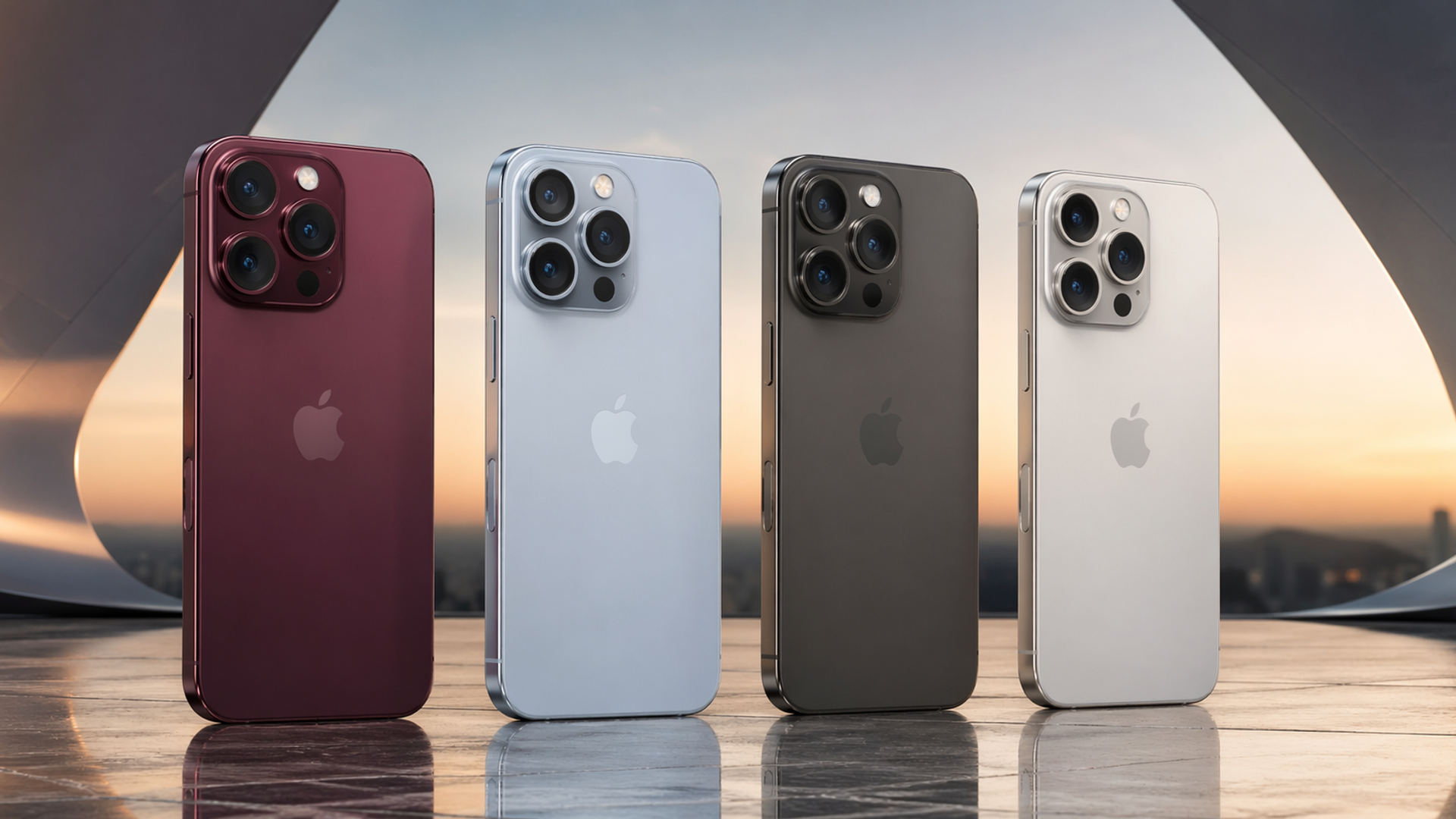
As of July 23, 2026, Apple has not announced the iPhone 18 Pro or iPhone 18 Pro Max, so no color is official. Current reporting points to four test finishes—Dark Cherry, Light Blue, Dark Gray, and Silver—but Apple can change or cancel finishes before launch.
Reviewed July 23, 2026. Apple has not announced the iPhone 18 Pro colors; this page clearly separates confirmed iPhone 17 information from iPhone 18 reporting.
The strongest current report comes from Macworld’s supply-chain coverage. Dummy units and component leaks can show colors being tested; they do not confirm retail names, materials, or final availability.
For confirmed context, Apple currently lists the iPhone 17 Pro line in deep blue, cosmic orange, and silver on its official newsroom page. Use the sections below as a rumor tracker until Apple publishes the next Pro lineup, or compare currently available luxury phones if you are buying now.
Rumored iPhone 18 Pro Max Colors: What Is Reported
Dark Cherry – The Signature Color of 2026
Dark Cherry is the most consistently reported candidate for the iPhone 18 Pro and Pro Max. It remains a reported test finish—not an Apple-confirmed product color.
Unlike the brighter, more playful tones Apple experimented with in recent years, Dark Cherry leans toward a deep, wine-inspired red—subtle, elegant, and unmistakably premium. It’s the kind of color that doesn’t demand attention but earns it.
This aligns with Apple’s long-standing strategy of introducing a signature shade each year. In 2026, that signature appears to be less about boldness and more about refinement.
Who it’s for:
- Professionals seeking understated luxury
- Users upgrading from classic black or graphite
- Those who prefer timeless over trendy
Light Blue – A Softer, Modern Aesthetic
On the opposite end of the spectrum, Light Blue offers a calmer, more contemporary feel.
Think less “bright tech gadget” and more “minimalist lifestyle object.” This shade is expected to echo Apple’s broader ecosystem design—clean, airy, and quietly modern.
Who it’s for:
- Younger users or creatives
- Fans of Apple’s softer color palette
- Those who want a device that feels fresh but not loud
Dark Gray – Minimalism Returns
Dark Gray is Apple doing what it does best: restraint.
This color sits close to the familiar Graphite or Space Black, but with subtle refinements in finish and depth. It’s the default choice for users who value discretion and consistency.
Who it’s for:
- Business users
- Long-time iPhone Pro buyers
- Anyone who prefers a low-profile, high-end look
Silver – The Timeless Classic
Silver remains untouched—and for good reason.
It reflects light beautifully, pairs seamlessly with titanium or stainless steel finishes, and never feels outdated. While it may not generate headlines, it consistently delivers.
Who it’s for:
- Traditionalists
- Users who want longevity in design
- Those who appreciate simplicity done right
A Shift Toward Mature Luxury
Taken together, the reports suggest a more restrained palette than the iPhone 17 Pro lineup. That interpretation is provisional until Apple confirms the materials, names, and retail finishes.
This mirrors broader trends across industries—from automotive to watchmaking—where consumers increasingly favor depth, texture, and subtlety over brightness.
In other words, the iPhone is no longer just a tech product. It’s becoming a lifestyle object.
Which iPhone 18 Pro Max Color Should You Choose?
If you do decide to go with Apple’s latest, here’s a simple way to think about it:
- Dark Cherry → For those who want something distinctive yet sophisticated
- Light Blue → For a modern, creative feel
- Dark Gray → For understated professionalism
- Silver → For timeless reliability
Ultimately, the best choice is the one that still feels right a year later—not just on day one.
Beyond Color: What Else to Expect from iPhone 18 Pro Max
While color may be the most visible change, it’s far from the only one.
Refined Design
Reports also discuss display and Face ID changes, but Apple has not confirmed them. Treat design renders and dummy units as directional evidence rather than final specifications.
Next-Generation Performance
Industry reporting expects a next-generation Apple chip, but the chip name, process, and performance gains are not official. Do not make a buying decision from projected benchmarks.
Camera Innovation
A variable-aperture main camera is among the reported possibilities. Apple has not confirmed the feature, so comparisons should wait for an official specification and independent camera testing.
Release Timeline
A fall 2026 Pro launch is widely expected from Apple’s historical cadence, but Apple has not announced an event date or retail schedule.
The Hidden Limitation of iPhone Colors
Despite these improvements, one limitation remains unchanged: choice.
Each year, Apple offers only a handful of color options—typically three to four. While these are carefully curated, they are ultimately the same for millions of users worldwide.
This creates an interesting paradox: Even at the highest price tier, personalization remains limited.
For users who view their phone as an extension of their identity, this can feel restrictive.
Beyond Apple: When Color Becomes Personal
This is where the conversation begins to shift.
Because once you start thinking about color as a form of expression—not just selection—the question changes from:
“Which color should I choose?” to “Why am I limited to these options at all?”
Vertu and the Idea of True Customization
Luxury, by definition, is not about choosing from a menu. It’s about creating something that reflects you.
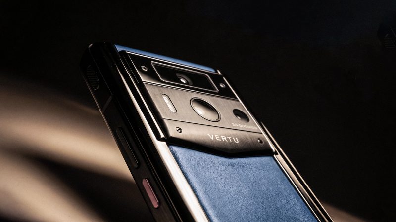
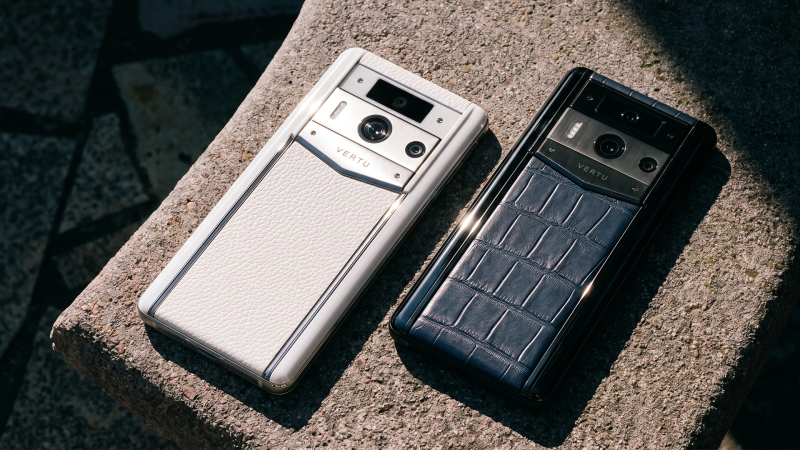
Brands like Vertu approach mobile design from this perspective—where materials, colors, and finishes are not fixed decisions, but variables.
Take the Agent Q Alligator Skin as an example.
Instead of offering a small set of predefined colors, it opens up a much broader spectrum—from classic tones to bold, highly individual finishes. More importantly, it pairs color with materiality: handcrafted alligator leather, precise detailing, and a tactile experience that goes beyond visual design.
This isn’t just about having more options. It’s about redefining what a “color choice” means.
From Color Selection to Identity Design
What distinguishes this approach is the shift from selection to creation.
- With mainstream smartphones, color is the final step in the buying process.
- With luxury devices, color is part of the design narrative from the beginning.
You’re not choosing what’s available—you’re defining what should exist.
And for a growing segment of users, especially those accustomed to bespoke experiences in fashion, automotive, or watchmaking, that distinction matters.
iPhone vs Luxury Phones: A New Kind of Decision
This doesn’t make one approach better than the other—it makes them different.
iPhone 18 Pro Max
Vertu Devices
Exceptional technology
Emphasis on craftsmanship
Refined, curated color palette
Extensive personalization
Designed for a global audience
Designed for individuality
The real question isn’t which is superior. It’s the philosophy that aligns with how you see your device.
Conclusion: Is Choosing a Color Enough?
The iPhone 18 Pro Max may bring a new palette, but today the responsible conclusion is narrower: four colors are being reported, none is official, and final buying advice must wait for Apple’s announcement.
But it also highlights a deeper shift in user expectations. Color is no longer just a finish. It’s a form of expression.
And as that expectation grows, so does the desire for something beyond predefined options—something more personal, more intentional, and more unique.
Because in the end, the real question may not be: “Which color do you like?”
But rather: “Is that the only choice you want to have?”