NASA and ISRO’s NISAR satellite has produced a striking radar image of fractured ice flowing around an Antarctic mountaintop. Scientists nicknamed the shape “the hummingbird” because the green crevasses and surrounding radar returns resemble a bird in flight.
The picture is visually memorable, but it is not a conventional photograph. NISAR sent microwave signals towards Earth and measured how they returned. Colours were assigned to different polarisation responses so that scientists could interpret smooth ice, irregular crevasses and mixed scattering.
The result shows why radar satellites are valuable: they can observe surface structure through darkness and many weather conditions. It also shows why colourful satellite images need explanation. Magenta is not the natural colour of Antarctic ice, and one image cannot by itself prove that a glacier is accelerating or that climate change caused a specific fracture.
How to read the “hummingbird” image
| Display colour in NASA’s explanation | Radar behaviour | Likely surface interpretation | Caution |
|---|---|---|---|
| Magenta | Stronger horizontal return | More regular or smoother ice surface | Colour is assigned, not visible light |
| Green | More vertical return after refraction or irregular scattering | Crevasses and rough fractured surfaces | Shape depends on geometry and processing |
| White | Strong horizontal and vertical response | Mixture of surface and volume scattering | Does not identify one material automatically |
| Darker areas | Weaker recorded return | Smooth reflection away from sensor, shadow or low backscatter | Not necessarily open water or absence of ice |
NASA’s NISAR mission news page and the JPL image description explain the polarisation display and the Nunatak Zaterjavshijsja feature in East Antarctica.
NISAR is a radar mission, not a camera
NISAR stands for NASA–ISRO Synthetic Aperture Radar. Synthetic-aperture radar uses the satellite’s movement and signal processing to create detailed images from microwave echoes.
A camera records reflected visible or infrared light. Radar sends its own energy. This means it can observe at night and see through many cloud conditions. That is especially useful in polar regions, tropical forests and disaster zones where optical imagery can be blocked or infrequent.
Radar records properties such as backscatter amplitude, phase and polarisation. Those measurements respond to roughness, moisture, structure and geometry. Scientists compare repeated observations to detect change, but interpretation requires context.
The “hummingbird” is therefore a data visualisation. Its colours help readers see different scattering mechanisms; they are not a view an astronaut would see from orbit.
Why L-band and S-band matter
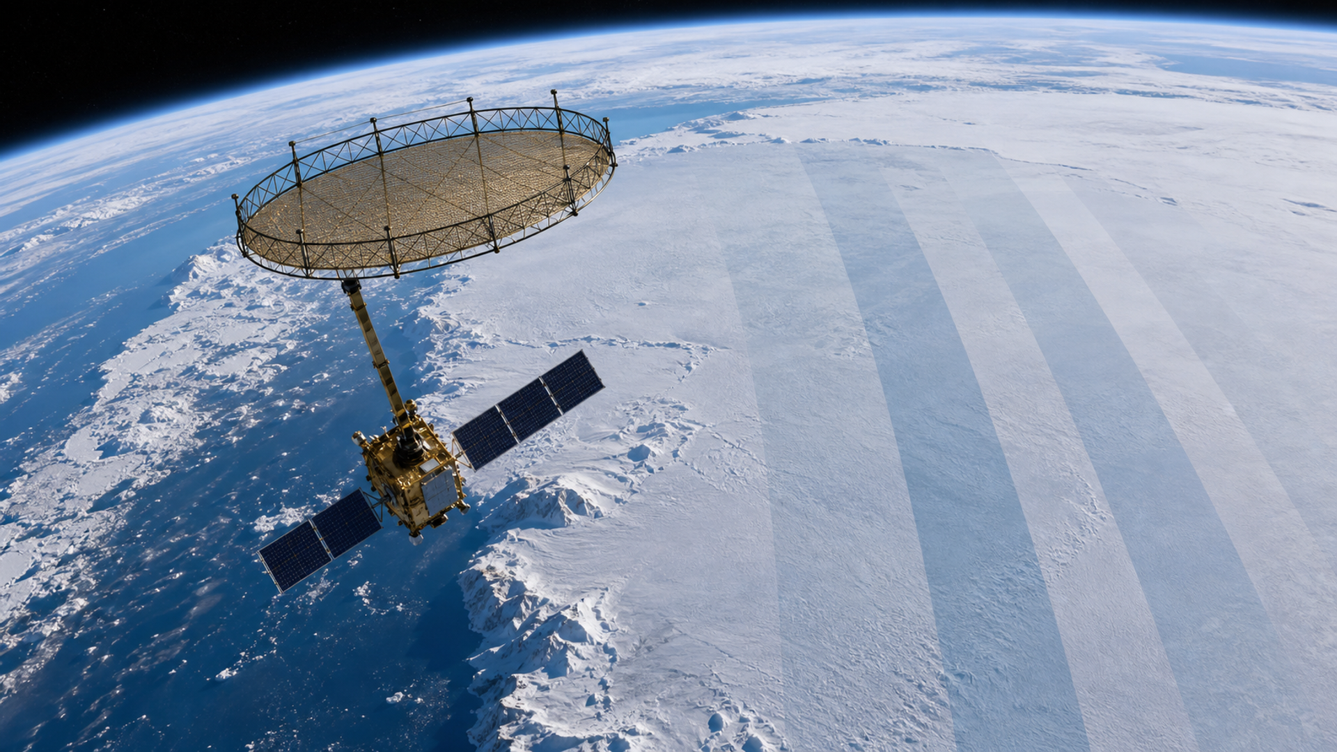
NISAR is the first satellite to carry two synthetic-aperture radar instruments at different wavelengths: NASA’s L-band system and ISRO’s S-band system. The mission uses a 12-metre deployable reflector, described by NASA as the largest radar antenna reflector it has sent into space.
Wavelength affects interaction with surfaces. Longer L-band waves can penetrate vegetation canopies more effectively than shorter radar wavelengths and remain coherent over certain changing surfaces. S-band provides complementary sensitivity and resolution for other applications.
In ice, wavelength, polarisation, snow conditions, surface roughness and geometry all affect the return. Using two bands gives researchers more information than one radar alone, but it does not create an automatic material label. Scientists still calibrate, compare and validate with field or other remote-sensing data.
What created the hummingbird shape
The image centres on Nunatak Zaterjavshijsja, a mountaintop protruding through the ice in East Antarctica. Ice flows around the obstruction towards the ocean. Stress fractures the surrounding surface and creates deep crevasses.
Those irregular faces scatter radar energy differently from smoother ice. In the displayed polarisation combination, many crevasses appear as sharp green lines. The pattern produces the wing-like shape.
The important scientific information is not that the feature resembles a bird. It is that radar reveals the structure of flowing and fractured ice in detail. The nickname makes the image accessible without changing the underlying measurement.
What NISAR can measure over time
A single scene describes a surface at one observation. A sequence can reveal change. Depending on the product and method, repeated radar observations can help researchers study:
movement of glaciers and ice sheets;
ground deformation after earthquakes or volcanic activity;
subsidence caused by groundwater or extraction;
landslides;
forest structure and biomass;
agricultural change;
wetland and flood dynamics;
surface disturbance.
One powerful technique is interferometric synthetic-aperture radar, which compares the phase of signals from repeat passes. Small phase differences can indicate movement along the radar’s line of sight. The method can detect subtle deformation, but atmosphere, surface change and orbit errors must be corrected.
NASA says public data from NISAR’s L-band and S-band instruments began becoming available from 20 July 2026. Open data allows scientists and operational agencies to build long records and applications rather than relying on isolated publicity images.
What one radar image cannot prove
The hummingbird scene cannot on its own establish a trend. It does not show whether the crevasses are new, growing or unusual without comparison data. It does not assign a cause to the fractures. It does not measure global ice loss.
Avoid these common mistakes:
Treating assigned colours as natural surface colour.
Assuming bright means high elevation or heat.
Calling every dark area water.
Inferring movement from one timestamp.
Attributing one feature to climate change without a time series and physical analysis.
Reading an artistic resemblance as scientific classification.
The image is evidence of structure. Trend claims require repeat observations, calibration and supporting measurements.
The polarisation lesson
An electromagnetic wave has an orientation. NISAR can transmit and receive signals in different horizontal and vertical combinations. A smooth surface may return energy in one pattern; a complex, fractured or volume-scattering target may rotate or redistribute it.
Scientists combine these channels into colour composites. The exact colour mapping is chosen to make differences visible. Another processing choice could display the same data differently.
This is why a responsible caption should state the bands, polarisations, acquisition date, processing and colour interpretation. Without that information, a dramatic image can be mistaken for a literal photograph.
From image to decision
Earth-observation data becomes valuable when it supports a decision. A disaster agency may use deformation maps to identify areas requiring inspection. A water manager may track subsidence. A researcher may measure ice velocity. A farmer may combine radar with weather and optical data.
The decision chain should preserve uncertainty:
| Stage | Question |
|---|---|
| Observation | What did the sensor measure? |
| Processing | Which corrections and colour mappings were applied? |
| Interpretation | Which physical surfaces could create the signal? |
| Validation | Does field or other satellite evidence agree? |
| Change | Is there a repeatable difference over time? |
| Action | What threshold justifies inspection or intervention? |
Skipping from a colourful scene directly to a policy claim creates false confidence.
Why open data matters
NISAR is a US–India partnership. NASA’s Jet Propulsion Laboratory leads the US component and supplied the L-band radar and reflector; ISRO supplied the spacecraft bus and S-band radar.
Public data can broaden participation. Researchers without their own satellites can test methods, compare regions and build applications. Governments and commercial organisations can combine the data with local evidence.
Open availability does not eliminate technical barriers. Radar files can be large, products have different processing levels, and correct interpretation requires expertise. Documentation, cloud access and reusable tools determine whether the data reaches people beyond specialist teams.
How to evaluate future NISAR images
When another striking scene appears, check:
the acquisition and publication dates;
L-band, S-band or combined product;
polarisation channels;
whether colours are natural, false-colour or analytic;
spatial resolution and geographic extent;
whether the claim uses one scene or a time series;
which agency processed the image;
whether uncertainty and alternative interpretations are stated.
Also distinguish the sensor from a consumer communications satellite. NISAR observes Earth; it is not a satellite-phone network. The two technologies share orbit but answer different needs. Our satellite messaging versus Garmin inReach decision matrix covers the communications use case separately.
Visual value without visual exaggeration
The hummingbird image is strong Discover material because it has a concrete subject, unusual form and authoritative explanation. That does not justify overstating it.
The honest story is interesting enough: two nations built a dual-band radar mission; a 12-metre reflector sends microwaves towards Earth; polarisation reveals smooth and fractured ice; and the public can now work with the data. A bird-shaped pattern helps people enter that story.
For publishers, the lesson is to pair the image with a reader tool. The colour table above lets a non-specialist decode the scene and separates observation from inference.
The verdict
NISAR’s Antarctic hummingbird is not a photograph of coloured ice. It is a polarimetric radar visualisation of ice flowing around a mountaintop and fracturing into crevasses. Magenta, green and white represent different combinations of returned microwave signals.
The satellite’s larger value will emerge through repeat observations. L-band and S-band measurements can help researchers track ice, ground deformation, forests, agriculture and hazards in conditions that obstruct optical cameras.
Enjoy the image for what it is, but read it like data. Ask what the sensor measured, how the colours were assigned and what comparison supports any claim of change. That discipline turns a viral picture into useful scientific understanding.