

Most mobile dashboards are honest, and still unhelpful.
They show you what happened. They don’t tell you what changed, what likely caused it, who needs to act next, and what you should approve before the next meeting starts.
An AI analytics dashboard earns its place on your phone when it closes that gap: from metrics to explanation to decision.
In this article, we’ll outline what that evolution looks like in practice, why it matters specifically on mobile, and how to keep it governed—so the convenience of a pocket dashboard doesn’t become a privacy risk.
Key takeaways
A mobile dashboard should be exception-first: fewer KPIs, clearer priorities, and proactive alerts.
A true AI analytics dashboard does more than detect anomalies—it explains them using variance and driver logic, then recommends next actions.
The executive version of “insight” is an approval-ready decision packet: what changed, why, confidence, impact, and the smallest safe action.
Security is not a feature add-on. Treat your executive dashboard like a control plane: role-based access, least privilege, and auditability.
Key TakeawayIf your dashboard can’t answer “what changed, why, and what should we do next?” it’s a reporting surface—not a decision system.
The problem with mobile dashboards: they show numbers, not decisions
Executives rarely lack data. They lack time.
A mobile dashboard is often consumed in fragments: between gates, between meetings, between time zones. Under that constraint, “more charts” isn’t a virtue. It’s noise.
The predictable failure modes look like this:
You see a KPI move (revenue down 7%, conversion down 12%).
You can’t tell whether it’s real, material, or a reporting artifact.
You forward it to a team: “What happened?”
The answer returns hours later, after context switching and spreadsheet archaeology.
This is why “dashboard adoption” stalls at the top: leaders don’t stop caring about the business; they stop believing the dashboard will reduce uncertainty fast enough to be worth opening.
What changes the equation is not a prettier visualization—it’s an explanation loop built for mobile.
Mobile BI vs desktop dashboards: different screens, different decision loops
A phone cannot replicate the density of a desktop dashboard. It shouldn’t try.
As Domo notes in its overview of mobile BI, “Desktop dashboards often prioritize density… Mobile BI requires focus and clarity.” That distinction matters because it points to a different default behavior: mobile is for prioritization and action, desktop is for exploration and deep comparison. (See Domo’s definition of mobile BI (2026).)
Yellowfin’s dashboard vs report framing is useful here: dashboards are built for fast, operational decisions using frequently refreshed data, while reports are better suited to deeper, curated analysis. (See Yellowfin on dashboards vs reports (2026 update).)
Put plainly:
Mobile is where you ask: “What changed? Do I need to act now?”
Desktop is where you ask: “What’s the complete story, and what should we change structurally?”
That’s not a limitation. It’s a design brief.
A mobile executive dashboard should be engineered around:
Fewer, higher-stakes metrics
Exception detection (only interrupt me when it matters)
Context compression (give me the minimum narrative that makes a decision safe)
A governed approval path (I can authorize, delegate, or hold)
What “AI analytics dashboard” should mean in practice
“AI dashboard” is now used to describe everything from auto-generated charts to chat-based querying.
For an executive, the useful definition is narrower:
An AI analytics dashboard is a dashboard that can:
Detect meaningful change (anomaly or threshold breach)
Explain the change in business terms (variance + drivers)
Recommend the next action (with risk level and confidence)
Route that action to the right person or approval step
This is the move from “data display” to what you might call decision infrastructure.
The key is the middle step—explanation. Without it, recommendations are either generic (“focus on retention”) or untrustworthy (“increase spend”).
Explanation requires a disciplined structure.
How AI explains sales and revenue changes (without hand-waving)
If you want AI to explain revenue, don’t start with a chatbot. Start with a model of the business.
A reliable explanation flow is layered. Each layer answers a different executive question.
Step 1 — Detect the exception: what changed, and is it real?
The dashboard flags what deviates from normal—by time window, geography, segment, channel, product line, or deal stage.
A mobile-first system should also do something subtle but important: it should tell you what it did not flag.
If everything is an alert, nothing is.
Step 2 — Build a revenue bridge: where did the variance come from?
Once the change is confirmed, the dashboard should quantify it as a bridge: actual vs last period, or actual vs plan.
This is where classic variance logic earns its keep. Revenue generally moves because of some combination of:
Volume (units, transactions, orders)
Price (realized price, discounting)
Mix (shift toward lower-margin segments or products)
Timing (recognition shifts, billing cycles)
On mobile, you don’t need the full workbook. You need the decomposition plus one tap to drill.
What this prevents: the common executive argument where everyone is right at once—marketing says demand fell, sales says pipeline is fine, finance says timing moved. A bridge pins the conversation to a shared arithmetic reality.
Step 3 — Rank drivers: what likely caused it (and how confident are we)?
Variance tells you where. Driver analysis tells you what is most associated with the change.
A disciplined AI explanation should:
rank contributors (top 3–5) rather than generate a long narrative
label confidence (high / medium / low) to avoid false certainty
separate correlation (“this moved with revenue”) from causation hypotheses (“this likely caused the move”)
This is also where executives need “why now?” not “what is.”
A useful explanation includes a trigger: a campaign start, a pricing change, a top-customer churn, a supply constraint, an approval bottleneck.
Step 4 — Turn explanation into next steps: who does what by when
The final layer is the one most dashboards never reach.
A decision-grade mobile dashboard should produce a next-step packet that is small, explicit, and safe:
- Recommended actionwhat to do
- Ownerwho should do it
- Deadlinewhen it should be done
- Risk levelcan it be executed automatically, or must it be approved?
- What will changethe exact object affected (budget, pricing rule, approval queue, inventory allocation)
This is where AI becomes operational rather than decorative.
Pro TipRequire every recommendation to include “what changes in the system if we approve this?” It eliminates vague advice and forces governance.
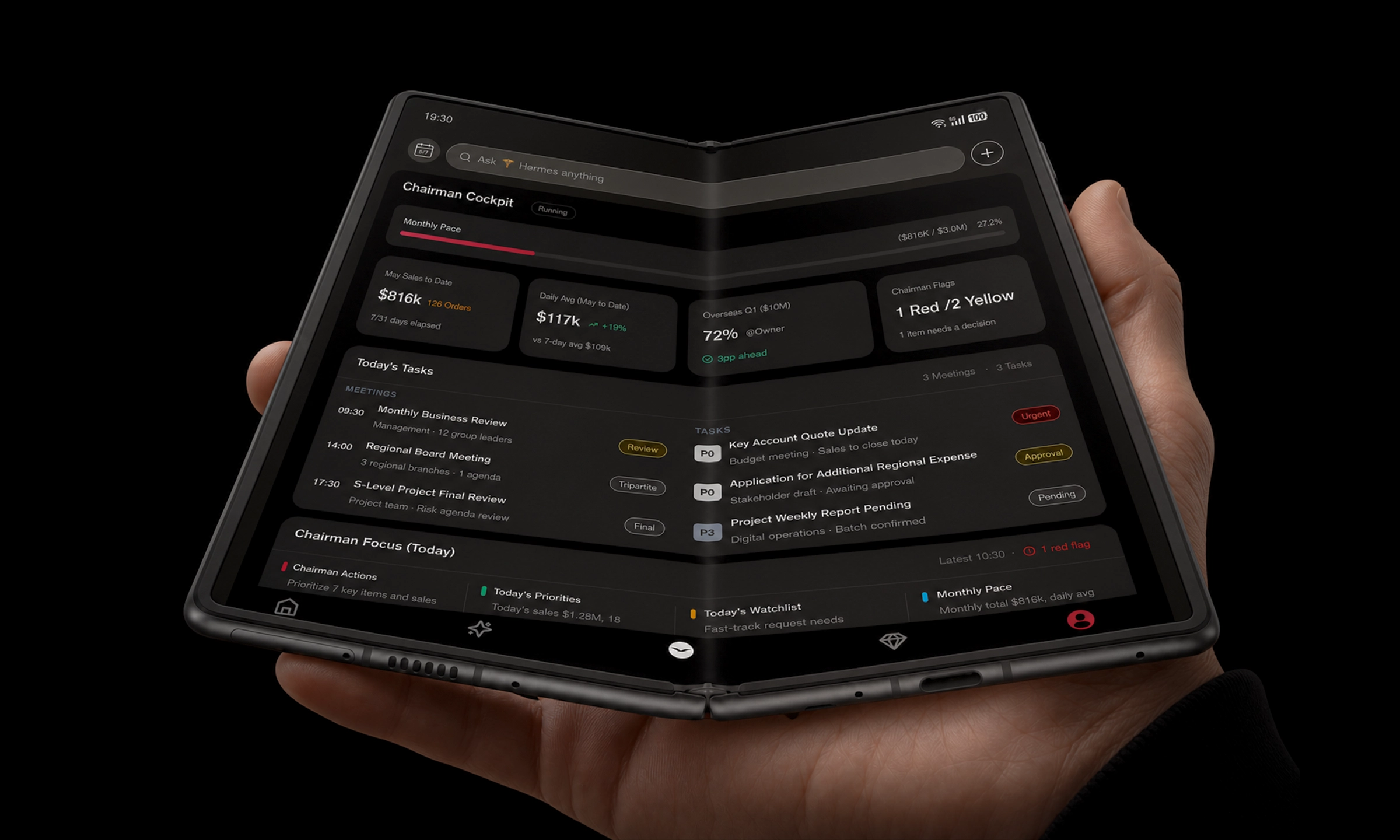
The AlphaFold inner screen as the executive command surface (a concrete workflow)
A mobile executive workflow succeeds when it treats the screen as a command surface, not a miniaturized BI portal.
On a foldable inner display, you can keep the executive’s mental model intact:
- Left panelthe revenue trend (week-to-date vs plan) with one highlighted anomaly
- Right paneldepartment ranking (who is above/below target), showing only material contributors
- Bottom stripapproval radar (items that need authority) and an operational change log (what changed since the last check)
Here’s what “from data to decisions” looks like in under two minutes:
You open the dashboard and see a revenue dip beginning yesterday afternoon.
The dashboard explains the dip as a bridge: volume down in one region, discounting up in one channel.
It ranks likely drivers: a promotion misconfiguration, a delayed approval queue, a fulfillment constraint.
It presents two next actions:
Approve a temporary policy change (with an expiry)
Delegate a diagnostic task to the right operator (RevOps / finance / ops)
This isn’t about replacing judgment. It’s about protecting it.
On mobile, the goal is not to think longer. It’s to reach a safe decision faster, with fewer back-and-forth messages.
If you want an example of the “Business War Room” framing for how a foldable screen can hold dashboard context, document context, and controlled approvals in one place, see VERTU’s guide on Hermes Agent inside VERTU AlphaFold.
Executive dashboard security and data access: the non-negotiables
The more actionable a dashboard becomes, the more dangerous uncontrolled access becomes.
If a dashboard only displays public KPIs, governance can be informal.
If a dashboard can route approvals, summarize contracts, or recommend policy changes, you should treat it as a control plane.
Least privilege is the baseline
CyberArk defines the principle of least privilege as granting users the minimum access needed to perform their job function. (See CyberArk’s definition of least privilege.)
For an executive dashboard, least privilege isn’t only about the executive.
It’s about:
assistants who need visibility, but not authority
department heads who should see their slice, not the entire company
analysts who should explore data, but not approve changes
Use role-based access control (RBAC) with data-level boundaries
RBAC is how you stop dashboards from becoming screenshots that travel further than intended.
A practical model includes:
dashboard access (who can open which dashboards)
dataset access (who can query which underlying data)
row/column rules (who can see which region, client tier, or sensitive fields)
Apache Superset’s security documentation offers a concrete example of this kind of governance: roles can be combined (e.g., Finance + Executive), and dashboards/datasets can be restricted to those roles. (See Apache Superset security docs on RBAC and Executive role.)
Auditability: know who saw what, and who approved what
At executive altitude, “who did this?” can become a board-level question.
Insist on:
audit logs for access and permission changes
approval trails for high-risk actions
periodic access review (remove permissions that are no longer required)
⚠️ WarningA mobile dashboard that can approve actions without a clear audit trail will eventually be treated as a liability—even if it improves speed.
If you want to see how VERTU frames permission boundaries and user confirmation for significant actions, the product overview of Hermes Agent permissions and privacy controls is a useful internal reference point.
A practical checklist for choosing (or rebuilding) a mobile executive dashboard
Use this as a quick test.
1) Does it prioritize exceptions over totals?
- Why it mattersexecutives act on change, not on static numbers.
- How to implementdefine materiality thresholds, and reduce metrics to a small set tied to decisions.
- Failure modedaily checking becomes a ritual; no one trusts alerts.
2) Can it explain revenue changes as a bridge before it offers “insights”?
- Why it mattersyou can’t approve action without knowing where impact comes from.
- How to implementstandardize variance decomposition (price/volume/mix/timing) and segment breakdowns.
- Failure modeAI generates plausible narratives that don’t reconcile to finance.
3) Does it separate facts, hypotheses, and recommendations?
- Why it mattersexecutives need clarity on what is known vs what is inferred.
- How to implementlabel confidence and evidence, keep hypotheses short, link to the underlying driver signals.
- Failure modethe organization debates the AI instead of solving the problem.
4) Are recommendations approval-ready?
- Why it mattersthe output of analytics should be a decision packet, not a prompt for another meeting.
- How to implementevery recommendation includes owner, deadline, risk level, and “what changes if approved.”
- Failure modeyou get “next best actions” that are too generic to execute.
5) Is access governed by role and least privilege?
- Why it mattersexecutive dashboards often contain the most sensitive business truths.
- How to implementRBAC + data-level restrictions + audit logs + periodic access review.
- Failure modepermission creep; sensitive views become widely accessible over time.
6) Does it respect mobile reality: attention, context, and travel?
- Why it mattersmobile is used in imperfect conditions.
- How to implementfast load, offline-tolerant summaries where appropriate, and a short “executive brief” view.
- Failure modethe dashboard is technically correct and practically unused.
Next steps
If you are evaluating how an AI-guided executive dashboard might look on a foldable inner screen—while keeping approvals, access, and auditability explicit—VERTU’s VERTU Professional System (VPS) provides a reference architecture for an executive layer across authorised systems.
Disclosure: This article references VERTU pages. Editorial judgment remains the priority.



![Top 10 Tourbillon Watches for Men [2026 Latest]](https://cdn.sanity.io/images/e0gp1l2g/production/8cb6bc45133cf9453382fc7d074465af588bb610-1800x1080.webp?w=800&h=450&q=82&auto=format&fit=crop)