Scroll. Flick. Skip. This is the power of the modern attention span. On social platforms where the content is displayed for viewing, be it lifestyle posters or ads—no one gets a chance to be politely looked at. The impact of the first three seconds in determining whether one will stop to look, squint to focus, tap on it. Or simply scroll away as if nothing even existed.
This is why contemporary poster and advertising design in fitness and health industry has nothing to do with, once again, filling a void or a blank space. It’s all about visual triage: what lands first, what reads second, and what lingers long enough in a viewer’s consciousness to foster curiosity. To this end, with the use of Dreamina's AI image generator or something similar, designers can whip up daring layouts, catchy headlines, and arresting visuals in a jiffy, before settling on a final visual design that attracts all the health freaks.
Creating designs for healthy lifestyle moments
Lifetstyle enthusiasts don’t read newsfeed posters. They feel them. Color bars, contrast, facial expressions, and headline shapes are felt before being read. Your message is competing not just with ads—but with memes, messages, and friends’ photos.
Designers now think in terms of layers of instantaneous recognition:
- What is the first element to reach the eye when the screen is moving?
- Whether the headline can be understood not reading every word?
- How fast the visual context explains it all in terms of relevance?
If your message needs explanation, it's already too slow.
Headline snap: words that land before logic
In fast-scroll environments like sports or healthcare, headlines act more like visual objects than sentences. Short phrases and sharp verbs and unexpected word pairings beat out smart but dense copy.
The most powerful scroll headlines tend to:
- Use 3–6 words max
- Feel conversational, not corporate
- Create a micro-question or emotional hook
- Work even when partially cut off on screen
Instead of an explanation of the fitness product, they hint at a feeling or outcome-rewarding the viewer for stopping just long enough to learn more.
Layout gravity: guiding the eye without asking permission
Excellent social posters are not dependent on balance but operate within the realm of gravity. They place elements, like fitness gear, health supplies, and apparel, in such ways that your eye is automatically led to where they want it to look, even in a glance that lasts only half a second.
Designs that halt the thumb may consist of:
- One dominant focal point (not three)
- Clear relationship between headline, visual, and brand
- Positive empty space to avoid visual noise
- Cropping that feels bold, not polite
This is where experimentation comes in. Quickly varying several compositional options allows the design team to see which one will draw attention most efficiently, and not necessarily the one that will look the most aesthetically pleasing on its own.
Turning static ideas into motion-ready lifetstyle visuals
Although posters are still full-proof, there has been a significant increase in the use of test designs, which involve thinking about how the physical health design would look if it were turned into a video, even if it started out as a static ad. Making short videos using Dreamina's AI video generator helps in testing posters as videos just through text. This is not about animation tricks or loop effect animation.
This isn’t about animation tricks or loop effects. It’s about creating a clean, single-camera video visual treatment that illustrates how a wellbeing poster idea could exist as a short video asset in a social feed. Designers can begin thinking about pace, composition, and headline treatment without ever starting actual production, making the transition from static to video feel thoughtful, not rushed.
Visual tone: aligning visual style with platform atmosphere
Every social platform has its own visual rhythm. What passes for bold on one platform can feel like it's shouting on another. Successful ads respect the native velocity of the environment they are placed in.
That would include considering:
- Bright versus muted colors based on feed behavior
- Clean typography vs. Playful lettering
- Living with reality: Comparison of real-world textures and digital
Dreamina's AI art generator can also help the artist fine-tune these visual tones quickly by playing with style, finish, and artistic elements to make the poster feel as if it belongs there rather than sticking out. This is not about camouflaging but making the poster noticeable without breaking the visual discourse.
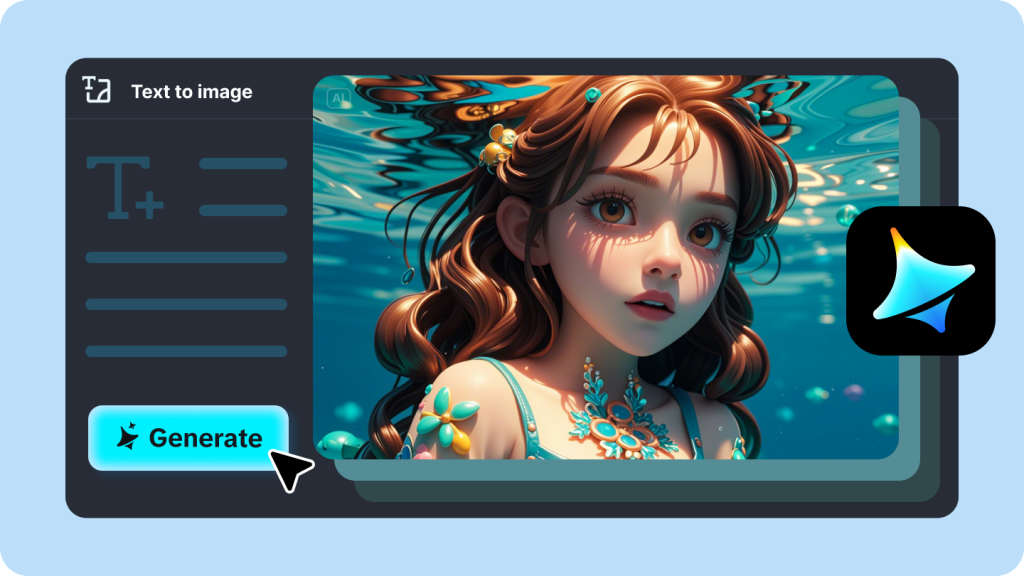
From idea spark to feed-ready lifestyle poster with Dreamina
Step 1: Write a text prompt
Go to Dreamina and concentrate your thoughts on constructing an informative and descriptive text prompt about your poster or advertisement design concept. This will involve incorporating platform vibe, tone of emotion, layout design, and graphic style.
For instance: Create a striking social media poster for a fitness app with a high-contrast background, a strong human figure using dynamic cropping, a three-word motivational headline displayed in large font, and a clean and modern design optimized for a mobile scroll.
A good prompt provides all the context that Dreamina requires to create images that already think like a social feed.
Step 2: Adjust parameters and generate
It is essential to select an appropriate design model depending on whether one would like to produce minimal, colorful, or editorial posters. You also need to specify the aspect ratio depending on one’s intended platform, choose size and resolution (1k resolution is ideal for testing, while 2k resolution is best for final prints), and select Dreamina’s icon to produce the design.
Step 3: Edit and save
Use Dreamina’s AI tools for customization. Inpaint to clarify headlines in a photo, extend the canvas for alternate crops, eliminate distractions, or retouch to increase contrast. Finally, when the poster is ready for a social media feed, click on the “Download” icon to publish.
Why the first three seconds are now the whole game
Social feed design has nothing to do with fitting as much information as possible onto the page and has everything to do with stripping away all that makes it hard to understand. The best fitness and wellbeing posters are, in hindsight, obvious and, in the moment, irresistible.
They understand the way people scroll, not the way brands think they should scroll. Plus, thanks to platforms like Dreamina, designers have the ability to rapidly prototype, test, and refine designs quickly enough to keep pace with shifting patterns.
In a world where every thumb is impatient, to win those first three seconds isn’t nice to have—it’s the whole plan.