Recently, the design world has become more and more “ugly” like a runaway horse… However, the public has been tolerant of this trend and has even participated in the popularity of the “New Ugly” (New Ugly). What is “New Ugly”? How to view this phenomenon?

As the saying goes: People who don’t look good at first glance may become more appealing over time… But what about designs that don’t look good at first sight?
Do you feel the same way? Taking “Ye Shuzhi Coconut Juice” as an example, people’s tolerance for it is indeed increasing day by day. Recently, the brand’s visual presentation, which has been uniform for decades, has swept the internet, with netizens imitating the poses in the advertisements and emulating the brand’s design style. In general, it’s very “magical” and “addictive”. Previously, a certain coffee brand also cooperated with Ye Shuzhi Coconut Juice to produce a limited edition co-branded drink. Looking at this familiar packaging, your aesthetic standards should also start to “waver” – and suddenly you feel: surprisingly… it’s a bit good-looking?
What is the new Ugly?
Coconut Tree Brand Coconut Juice Collaborative Beverage
Following the clues, the “Coconut Tree Brand Coconut Juice Trend” is not an isolated case. A large number of similar works have already stormed into the design world. Represented by Japanese designer Takada Yui, the “New Ugly” (New Ugly) has become a new trend. This type of work can be said to be completely unrelated to beauty, harmony, and order, and is so careless that it is puzzling, but this is also one of the reasons why it stands out.
Yui Takada, “Diverse” Exhibition Poster, 2018
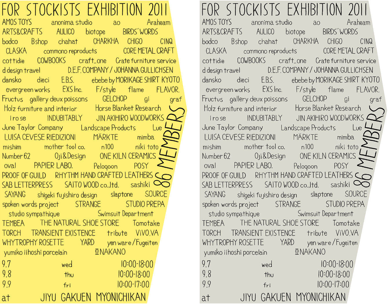
In 2011, the Great East Japan Earthquake occurred, which also triggered the Fukushima nuclear leak incident. In the series of posters she made for the “Stockists Exhibition” that year, Takada abstracted the shape of the Tohoku region in Japan using a pentagon, intending to connect society and art. However, in these works, the names of artists are stacked, the text is not centered or sans-serif, and the margins are zero… It can be said to be a design that drives obsessive-compulsive disorder to the extreme. In 2017, the artist also created promotional posters for JAGDA (Japan Graphic Designers Association). The rough printing feel, slightly conflicting colors, strange layout, and even some “rural flavor” – this is another typical example of the “New Ugly” design style.
Yui Takada, “Stockists Exhibition” poster, 2011
Takao Someya, poster created for JAGDA, 2017
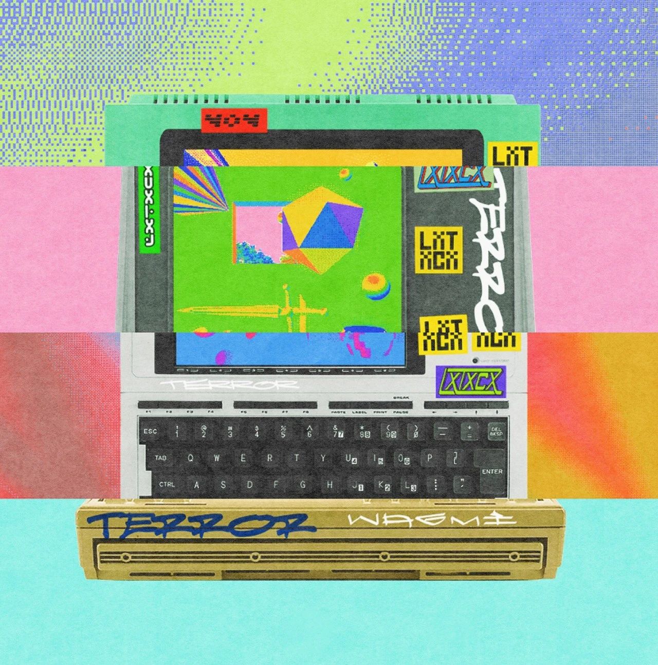
However, designers of the “New Ugly” style do indeed draw inspiration from “earthy” elements. Takao Someya is attracted to the designs or slogans found on city streets, which are touching due to their lack of “academic style” and directness in content delivery. Li Yixue, a designer who teaches at Parsons School of Design in the United States, also reaches the “New Ugly” style through the “earthy” elements that are readily available in life. His works draw from unique local visuals, using neon colors and familiar slogans to jointly construct the context of the urban fringe population.
Li Yixue, “On Being A Factory Worker” series, 2020.
Some designers, such as Li Gen, are using the “New Ugly” style to echo urban streets and satirize the established aesthetic system. It has to be said that this style is eye-catching and “down-to-earth”… However, it is precisely this design that goes against aesthetic standards that can carve out a “blood path” in the current saturated visual frenzy. Why does this phenomenon occur?
Li Gen’s Poster Design
“Ugly Chic” design, image source: the internet
“Where does beauty begin, and where does it end?
It ends where the artist begins.”
– John Cage, “Silence” (1961)
The opposite of “new ugliness” is “old beauty,” which can be traced back to the previously mentioned “academic style” or “classical.” Just as Cage proposed, if we extend the boundaries of art and design to a serious situation, it is necessary to pause the popular concept of beauty in order to explore alternative aesthetic standards. Therefore, when “beauty” becomes a disaster, “ugliness” emerges. This counter-routine action can be seen as a liberation of the existing aesthetic system.
Shinzo Noda’s “New Ugly” Design
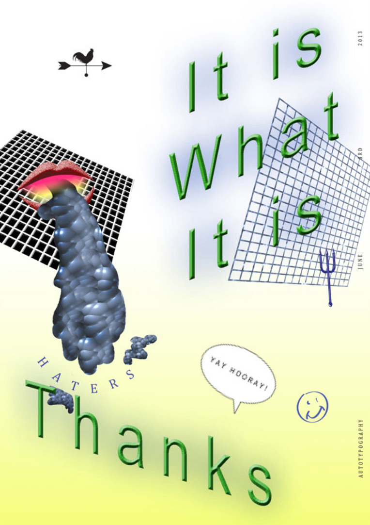
Singaporean designer Darius Ou started the Autotypography project on June 16, 2012. The project lasted for one year, during which a poster was created and released online every day. Among these 364 works, “good design” disappeared, and what emerged was a “new ugly” poster with no rules and a collision of colors. “I don’t want to follow the existing graphic design rules like the Bible,” Darius Ou explained.
Designer Darius Ou’s “Autotypography” project, 2012
Producing work every day for an entire year. It might sound like “new ugly” isn’t difficult? Perhaps, it could also be included in the “I could also paint/design” style series. Unfortunately, this might still be a “misplaced” effort. The design world’s rebellion against “beauty” is not a whim.
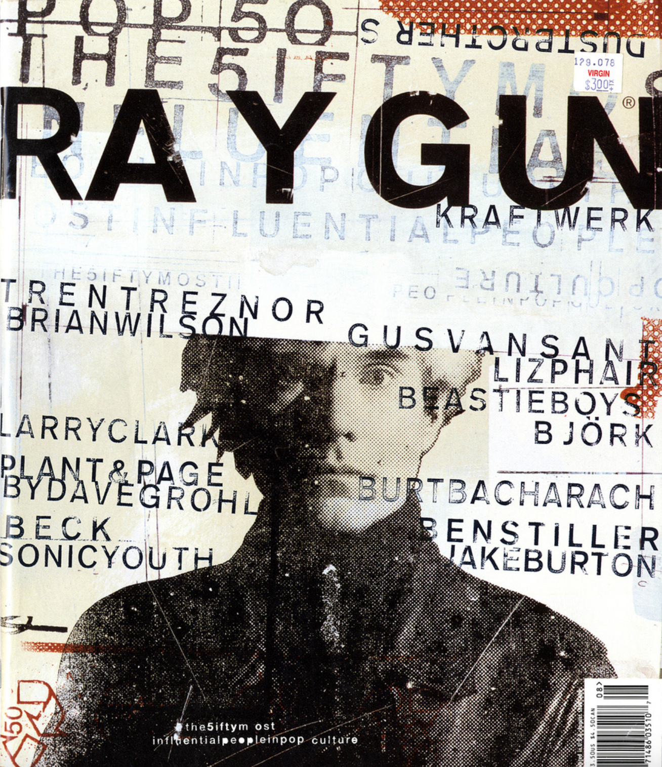
David Carson is known as the Andy Warhol of the magazine “Ray Gun” and was a leading figure in the field of design during the 1990s.
Anti-routine, for liberation
Designer Neville Brody’s design influenced by art movements such as Dadaism
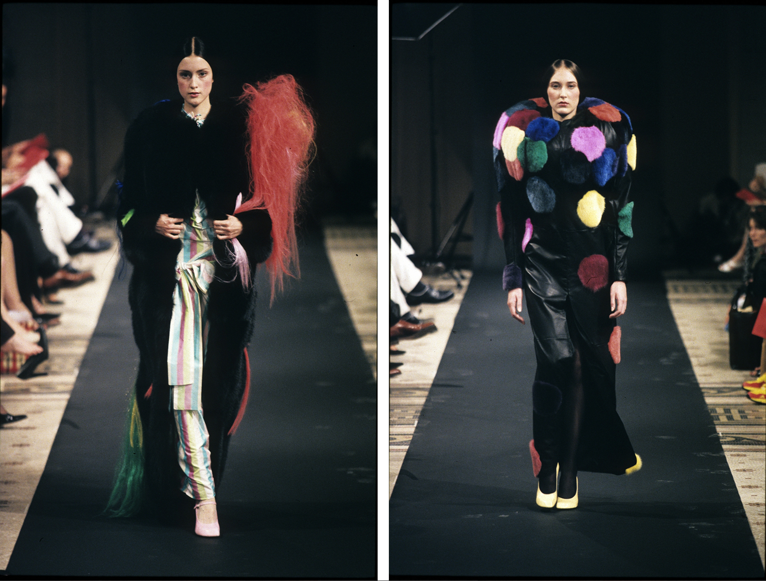
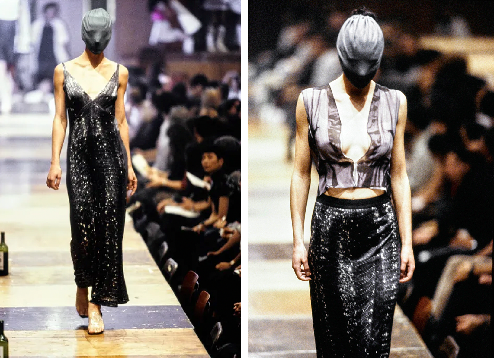
The Anti-Design movement, which emerged in the 1960s and peaked in the 1990s, fiercely attacked traditional design with its chaotic aesthetics and conflicting colors. Creators took root in the waves of hippie and rock culture, absorbing the rebellious soil, which was enough to bring shock to the two-dimensional plane. Many experimental ugly elements tore off the “exquisite” mask and emerged. The “three-dimensional” fashion world was even more avant-garde. Designers such as Viktor&Rolf and Maison Martin Margiela further carried the “alternative” to the end.
Viktor & Rolf 1998 Autumn/Winter, “Atomic Bomb” Collection
Maison Martin Margiela 1996 Spring/Summer Collection
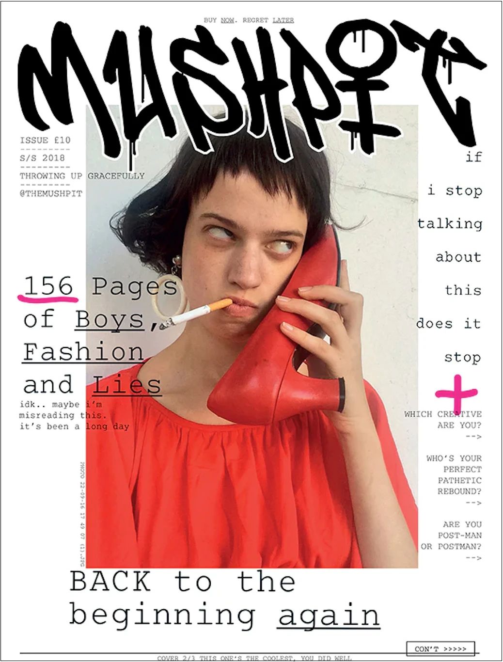
- “Mushpit” Magazine, 2018 *
So, the “New Ugly” trend of today is still a coherent and historical design cycle. Independent magazines such as “Mushpit” and “Hotdog Magazine” have fully embraced this new wave of “anti-design”; in the fashion industry, there are also cases like Balenciaga moving towards the “Age of Ugly”: it launched the “Qixi” series of bags with a rural-urban blend style in 2020, and last year’s new products included the “most expensive trash bag in history” (Trash Pouch) worth 12,000 yuan…
Although “sinking”, it does not affect the increase in Balenciaga’s sales at all. In addition to its unexpected visual impact, the brand has once again grasped the essence of “anti-routine” – the era pursues “exquisiteness”, and I show you the “New Ugly”.
Balenciaga “Qixi” Collection Bags, 2020

Balenciaga “Trash Pouch”, 2022
The “ugly review” in the design world is not short-lived. When we wonder if ugliness will go to extremes, we should understand that “New Ugly” is not only a “visual rest” for people, but also a deconstruction of design.
The inherent functions of design can be summarized as highlighting aesthetics, conveying information, or being practical. The core idea of deconstructionism is to subvert, destroy, and be anti-traditionalism. Therefore, once designers question their internal logic: must design be beautiful? Must design convey information? Deconstruction emerges. The rebellion against vision brings about “New Ugly”; the rebellion against functionality makes the practicality of the work dissolve, which we have also discussed in our article “Design, Useless?”.
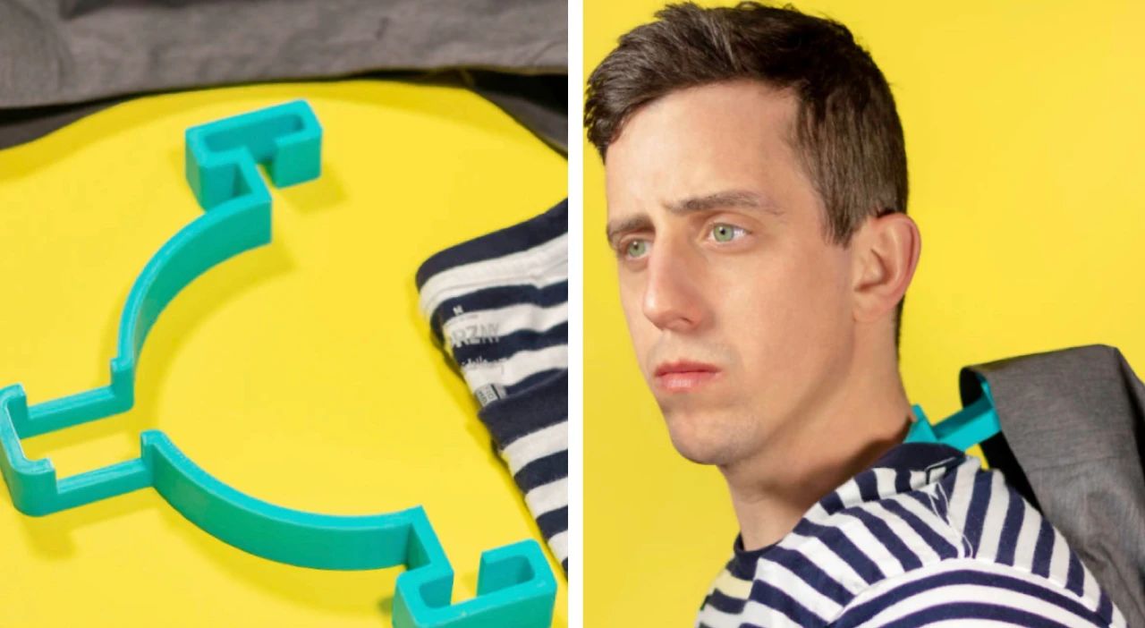
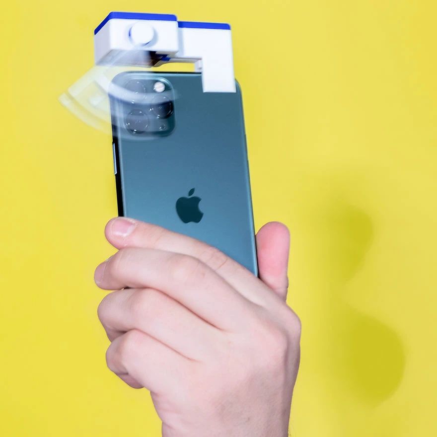
Matt Benedetto designed the “Phone Lens Cleaning Wiper”.
Portable Clothes Hook Designed by Matt Benedetto

Caterina Campriani’s “Uncomfortable Design” series of products.
After clarifying this core, perhaps we can reasonably predict whether the design will become uglier. When “ugly” is used as a means of rebellion, the designer aims to stimulate the viewer’s long-standing visual experience. Although it may not be “beautiful,” it does not create a work that is truly unacceptable in essence. “Ugly” is just a means of expression. However, if one blindly pursues “ugliness,” the visual aspect of the work can indeed be limitless, but its concept becomes hollow, and ultimately, it is difficult to achieve success.

Can Yang’s work “Kitsch”
Just like the early stages, Alexander Wang’s “kitschy video” posted on social media interpreted the popular “fan picking tutorial” from a while ago (which was later recreated in various ways with satire and humor by netizens). This attempt seems particularly abrupt and even unrelated to the brand’s previous design concept. It is more like it was made for the sake of popularity, and it also took advantage of a somewhat embarrassing wave of attention.
Is the design uglier?
The “Picking up Fans” video posted by Alexander Wang on social media was created by blogger Si Meizi in 2022.
The style of the videos previously released by the brand.
The “Ye Shuzhi Coconut Juice” mentioned at the beginning of the article has also “fallen” to such a situation. Its “new ugliness” style began to develop towards “vulgar” and “greasy” in the past two years, and even involved false advertising, causing a public opinion storm… After watching, one can only comment: my mother tongue is speechless.
It can be seen that when trying to attract attention by being unconventional, the core is inevitably superficial; and “new ugliness” will also face a short-lived fate if it is only for the purpose of attracting the viewer’s attention.
Whether it is “ugly” or “beautiful”, it needs to be viewed with caution and cannot be simply regarded as a “letting go”. Perhaps, this is a “true fragrance law” in any field? What do you think of the “new ugliness” style?
